Say hello to the redesigned Overview
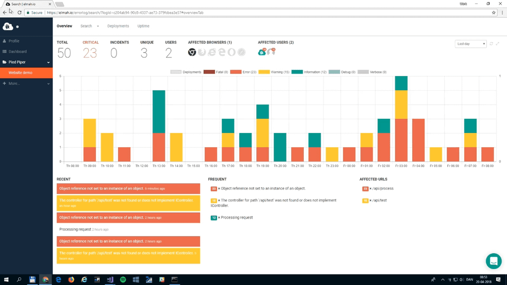
Since writing this post, a lot have happened to the elmah.io overview. Check out an updated version in this short video:

Back in April we launched the Log Overview – a new tab which gave you a chance to get an overview of your log activity within the last 24 hours. Today we’ve launched a new and redesigned Log Overview.
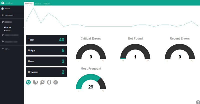
Since launching the Log Overview, we have used the new tab to monitor elmah.io itself. Furthermore a lot of you have send ideas and suggestions for changes through our support system. We ended up using most of the ideas from you guys, to build a new and improved Log Overview. But first, let’s look at the old Overview:

To sum up, what we mostly heard was:
- The sparkline chart on the top doesn’t really show anything but the development of errors.
- The black boxes containing summarized counts of various metrics are great, but they are too dominant and it would be great with an explanation on each counter.
- The critical and not found gauges are nice, but takes up too much space.
- No-one understood the content of the Recent and Most Frequent errors.
- Some of you suggested a summary of recent errors. Others wanted to see the most frequest error.
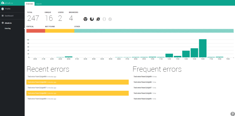
With that in mind, check out the redesigned Overview:

So what changed?
- The summarized boxes have moved to the top and now show an explanation when hovering each metric.
- The gauges have been replaced by a bar chart, showing errors grouped by “Critical”, “Not Found” and “Other”.
- The sparkline in the top have been replaced by the bar chart from the Statistics tab (now located in the middle). BTW this chart where the only remaining element on Statistics, why this tab is now removed.
- In the bottom left, there’s a list of the 5 most recent errors. The background color indicates the severity of each error. The bottom right contain a list of the most frequent errors.
- Almost everything on the overview is clickable. When clicking various metrics, you are redirected to the search tab, showing you errors matching the clicked metric.
We hope that you’ll enjoy the new Overview as much as we’ve enjoyed building it :)
elmah.io: Error logging and Uptime Monitoring for your web apps
This blog post is brought to you by elmah.io. elmah.io is error logging, uptime monitoring, deployment tracking, and service heartbeats for your .NET and JavaScript applications. Stop relying on your users to notify you when something is wrong or dig through hundreds of megabytes of log files spread across servers. With elmah.io, we store all of your log messages, notify you through popular channels like email, Slack, and Microsoft Teams, and help you fix errors fast.
See how we can help you monitor your website for crashes Monitor your website
