How to create custom controls in .NET MAUI
.NET MAUI is a powerful cross-platform mobile app framework by Microsoft. It is a reliable feature-enriched option for developers of all types of mobile applications. Its community toolkit, XAML-based designing, and modern C# coding support stand out from MAUI among its competitors. One key feature it provides is the creation of reusable custom controls. As a newer framework, many people find defining such controls difficult. In this blog post, I will show you in detail how you can create reusable custom controls throughout the application.
For this post, I will use an example of creating a custom button with properties like text, width, and command. Let's jump right into the steps required to do this.
Step 1: Create an MAUI project
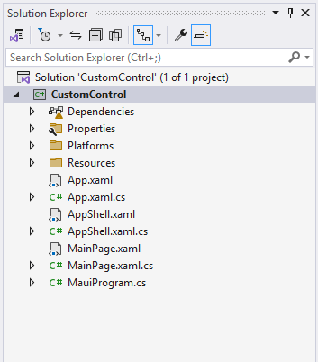
I'll use the normal MAUI template available through Visual Studio and name it 'CustomControl':
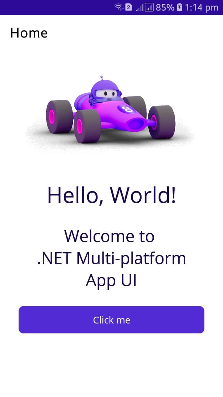
When the project has been successfully created, it can be run using the built-in emulator:
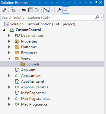
Step 2: Create a controls folder to keep custom controls
As we are following Model-View-ViewModel (MVVM), I have created a controls folder where I will save the custom control:
Step 3: Create ContentView
Right-click on the control directory and add a .NET MAUI ContentView (XAML) item as shown here:
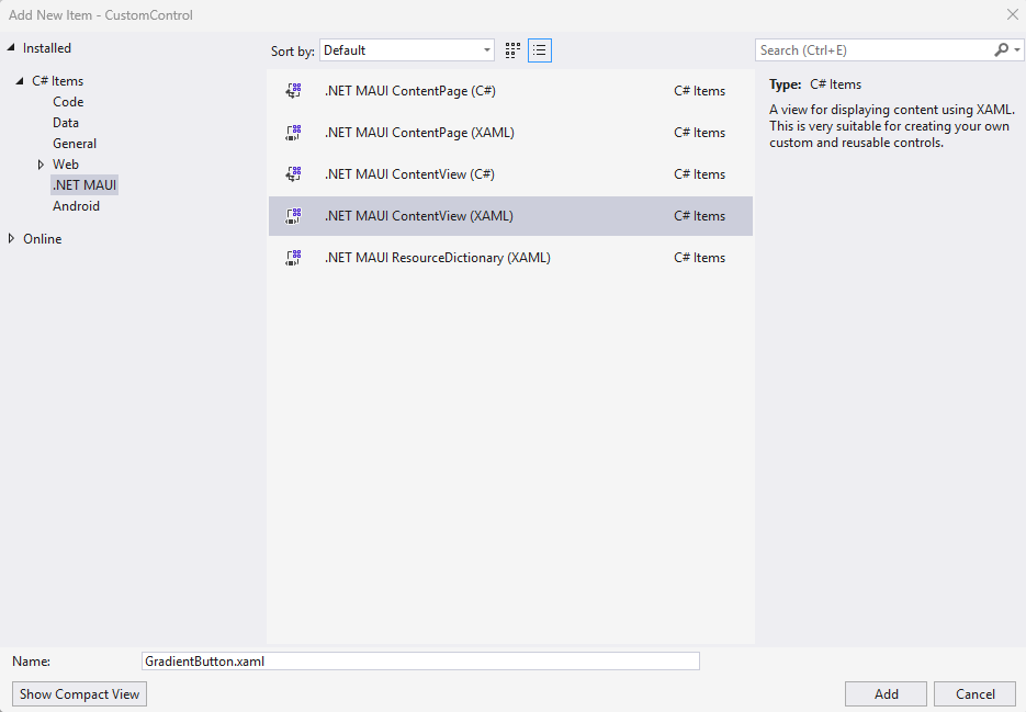
After the ContentView is created, you will see two files, one XAML file that is the visual design (UI) and one xaml.cs file containing logic:

This corresponds the structure that you may know from other project types utilizing XAML like WPF. A default Label was created:
<!-- GradientButton.xaml -->

<?xml version="1.0" encoding="utf-8" ?>
<ContentView xmlns="http://schemas.microsoft.com/dotnet/2021/maui"
             xmlns:x="http://schemas.microsoft.com/winfx/2009/xaml"
             x:Class="CustomControl.Views.controls.GradientButton">
  <VerticalStackLayout>
    <Label
      Text="Welcome to .NET MAUI!"
      VerticalOptions="Center"
      HorizontalOptions="Center" />
  </VerticalStackLayout>
</ContentView>
And
// GradientButton.xaml.cs

namespace CustomControl.Views.controls;

public partial class GradientButton : ContentView
{
    public GradientButton()
    {
        InitializeComponent();
    }
}
Step 4: define custom designer and properties
Now, we need to modify the design. Change the GradientButton.xaml to:
<?xml version="1.0" encoding="utf-8" ?>
<ContentView xmlns="http://schemas.microsoft.com/dotnet/2021/maui"
             xmlns:x="http://schemas.microsoft.com/winfx/2009/xaml"
             x:Class="CustomControl.Views.controls.GradientButton">
  <VerticalStackLayout>
    <Button
      x:Name="btnGradient"
      Text=""
      VerticalOptions="Center"
      HorizontalOptions="Center" />
  </VerticalStackLayout>
</ContentView>
I have replaced the label with the button that we want to customize for the rest of this post. The button is given a name by adding the x:Name="btnGradient" attribute. Change the code-behind file to:
namespace CustomControl.Views.controls;

public partial class GradientButton : ContentView
{
    public static readonly BindableProperty TextProperty =
        BindableProperty.Create(
            nameof(Text),
            typeof(string),
            typeof(GradientButton),
            string.Empty);

    public string Text
    {
        get => (string)GetValue(TextProperty);
        set => SetValue(TextProperty, value);
    }

    public GradientButton()
    {
        InitializeComponent();
        btnGradient.BindingContext = this;
        btnGradient.SetBinding(Button.TextProperty, new Binding(nameof(Text), source: this));
    }
}
In the code-behind file, A property named TextProperty of type BindableProperty is defined to get input when the GradientButton control is called. This allows the Text property to be bound in XAML or code to a data source and updates the UI whenever the property changes. Later, a Text property is defined to encapsulate the BindableProperty.
I set the value of the Text property to that button in the constructor:
btnGradient.SetBinding(Button.TextProperty, new Binding(nameof(Text), source: this));
Step 5: Use the control on a screen
To use control on a screen, first import it. I am doing it on the main page by including two instances of the custom button with different texts:
<?xml version="1.0" encoding="utf-8" ?>
<ContentPage xmlns="http://schemas.microsoft.com/dotnet/2021/maui"
             xmlns:x="http://schemas.microsoft.com/winfx/2009/xaml"
             xmlns:controls="clr-namespace:CustomControl.Views.controls"
             x:Class="CustomControl.MainPage">
  <!-- ... -->
  <controls:GradientButton Text="Login" />
  <controls:GradientButton Text="Register" />
Step 6: run the project
After building and running the project, you can now see two custom controls added to the screen:
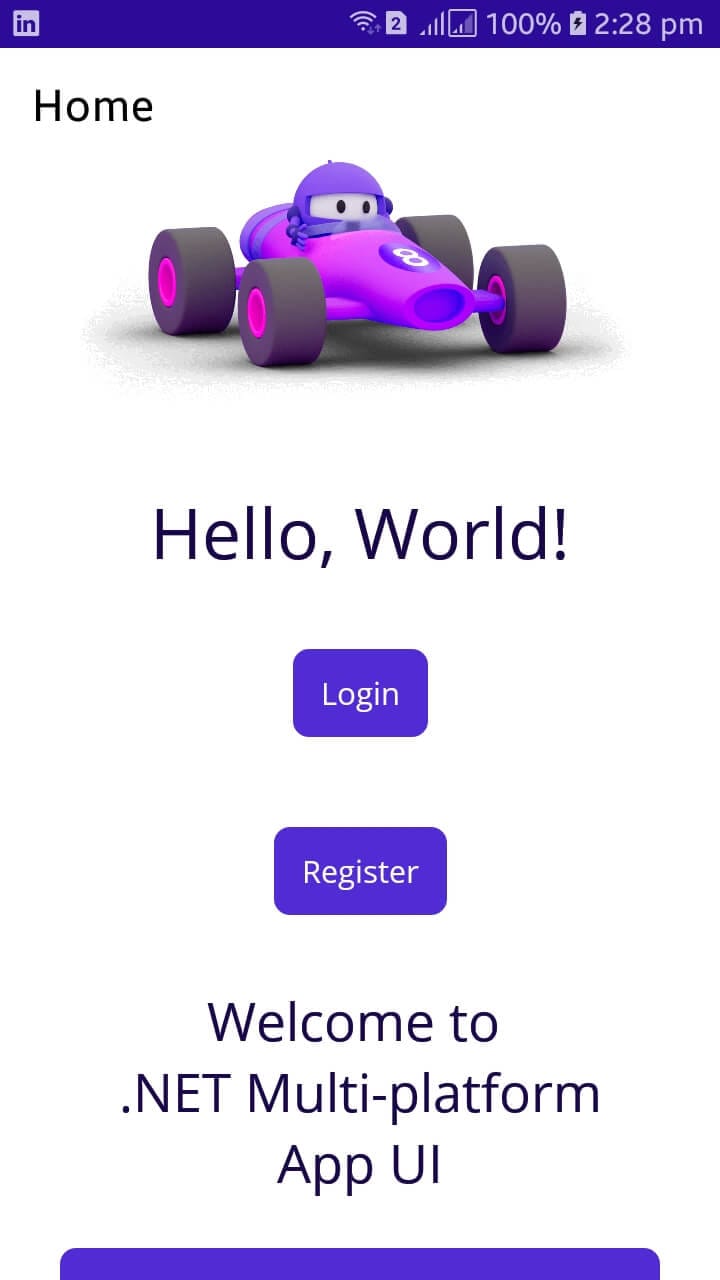
Yay! The custom control successfully shows up on the app. Let's enrich the button with even more custom features.
Step 7: define a coloring resource in the app
To define application theme color, we can define it in the App.xaml file:
<Application.Resources>
  <ResourceDictionary>
    <ResourceDictionary.MergedDictionaries>
      <ResourceDictionary Source="Resources/Styles/Colors.xaml" />
      <ResourceDictionary Source="Resources/Styles/Styles.xaml" />
    </ResourceDictionary.MergedDictionaries>
    <Color x:Key="DefaultWhite">#FFFFFF</Color>
    <Color x:Key="DefaultLightBlue">#0066FF</Color>
  </ResourceDictionary>
</Application.Resources>
Here I defined two new colors named DefaultWhite and DefaultLightBlue. These colors can be used in the GradientButton control by referencing them as static resources:
<Button
  x:Name="btnGradient"
  Text=""
  TextColor="{StaticResource DefaultWhite}"
  BackgroundColor="{StaticResource DefaultLightBlue}"
  VerticalOptions="Center"
  HorizontalOptions="Center" />
When launching the project, you will see that the styling of the buttons changed:
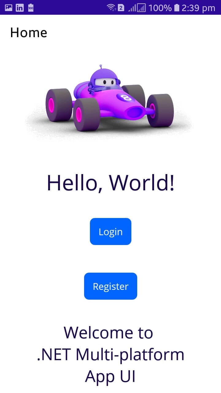
I know that it may be a bit misleading that I named the button GradientButton since the current styling is in fact just a solid color. However since this blog post quickly grew in size, and since the blog post is not about creating gradient styling in XAML, I decided to stick with a single color. If there's any interest, I can write a separate post about how to create gradient styling in XAML.
Step 8: add Width Property
We can similarly add properties that will be set when the control is used. Change the GradientButton.xaml.cs into the following code to include a Width property:
public partial class GradientButton : ContentView
{
    public static readonly BindableProperty TextProperty =
        BindableProperty.Create(
            nameof(Text),
            typeof(string),
            typeof(GradientButton),
            string.Empty);

    public static readonly BindableProperty WidthProperty =
        BindableProperty.Create(
            nameof(Width),
            typeof(double),
            typeof(GradientButton),
            double.NaN);

    public string Text
    {
        get => (string)GetValue(TextProperty);
        set => SetValue(TextProperty, value);
    }

    public double Width
    {
        get => (double)GetValue(WidthProperty);
        set => SetValue(WidthProperty, value);
    }

    public GradientButton()
    {
        InitializeComponent();
        btnGradient.BindingContext = this;
        btnGradient.SetBinding(Button.TextProperty, new Binding(nameof(Text), source: this));
        btnGradient.SetBinding(Button.WidthRequestProperty, new Binding(nameof(Width), source: this));
    }
}
The Width property can be used just like the Text property:
<controls:GradientButton Text="Login" Width="50" />
<controls:GradientButton Text="Register" Width="250" />
When running the project, we will see different widths on each button just as expected:
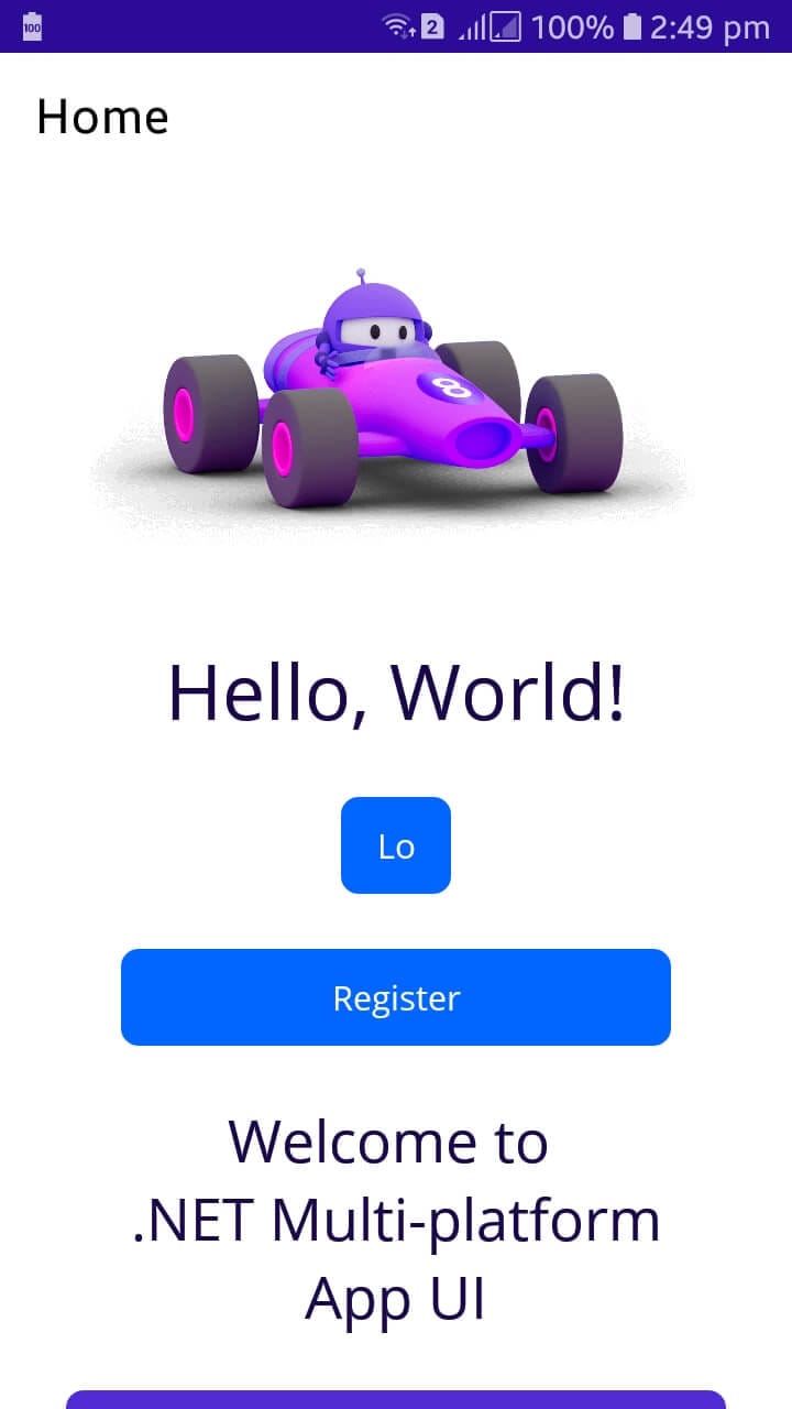
Step 9: Define ICommand for events
Until now, we have added properties for our custom control that changes the design on the UI. Now, let's add a command that will bind with control when control is used. Whenever users click a GradientButton, the specific bound command will be executed:
public static readonly BindableProperty OnCommandProperty =
    BindableProperty.Create(
        nameof(OnCommand),
        typeof(ICommand),
        typeof(GradientButton));

public ICommand OnCommand
{
    get => (ICommand)GetValue(OnCommandProperty);
    set => SetValue(OnCommandProperty, value);
}

private void CommandExecuted(object sender, EventArgs e)
{
    if (OnCommand != null && OnCommand.CanExecute(null))
    {
        OnCommand.Execute(null);
    }
}
In the GradientButton constructor:
btnGradient.SetBinding(Button.CommandProperty, new Binding(nameof(OnCommand), source: this));
btnGradient.Clicked += CommandExecuted;
The OnCommandProperty of type ICommand is declared as a bindable property for the OnCommand value. Its default value is omitted, which means null is the default. It is set when this component is bound with some command (LoginCommand and RegisterCommand in our case) that gets executed when the button is clicked.
The OnCommand property encapsulates OnCommandProperty in a way that is similar to what Text is doing with TextProperty. CommandExecuted handles button click event.
- It first checks if the
OnCommandis not null. - Verifies if the command can be executed using
CanExecute(null). - Executes the command with
Execute(null).
Step 10: Define ViewModel for Page
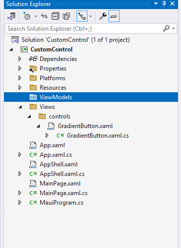
Add a new folder named ViewModels:
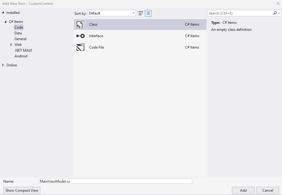
And inside this folder, add a new class named MainViewModel:
Step 11: Install CommunityToolkit.Mvvm
To implement MVVM for this project, I'll use the CommunityToolkit.Mvvm NuGet package. I won't go into more details about this package in this post, other than to show how it can simplify developing MVVM in MAUI. The package can be installed through Visual Studio:
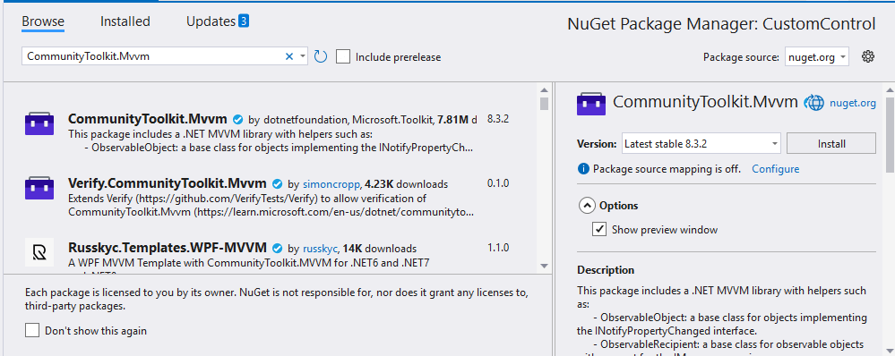
Or if you prefer the command line:
dotnet add package CommunityToolkit.Mvvm
Step 12: import ObjservableObject from MVVM and implement it in the ViewModel
In the created MainViewModel class, include the following code:
using CommunityToolkit.Mvvm.ComponentModel;
using System.Windows.Input;

namespace CustomControl.ViewModels
{
    public partial class MainViewModel : ObservableObject
    {
        public ICommand LoginCommand { get; }
        public ICommand RegisterCommand { get; }

        public MainViewModel()
        {
            // Initialize the LoginCommand
            LoginCommand = new Command(Login);
            RegisterCommand = new Command(Register);
        }

        private void Login()
        {
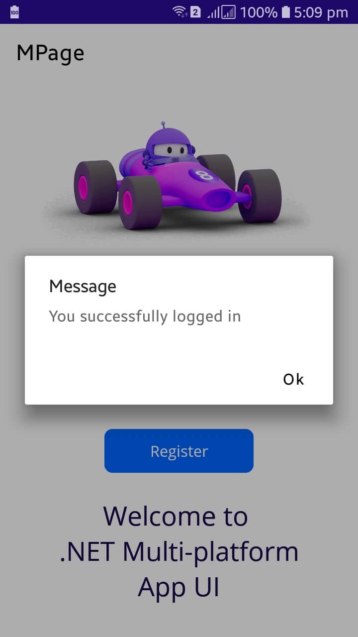
            Shell.Current.DisplayAlert("Message", "You successfully logged in", "Ok");
        }

        private void Register()
        {
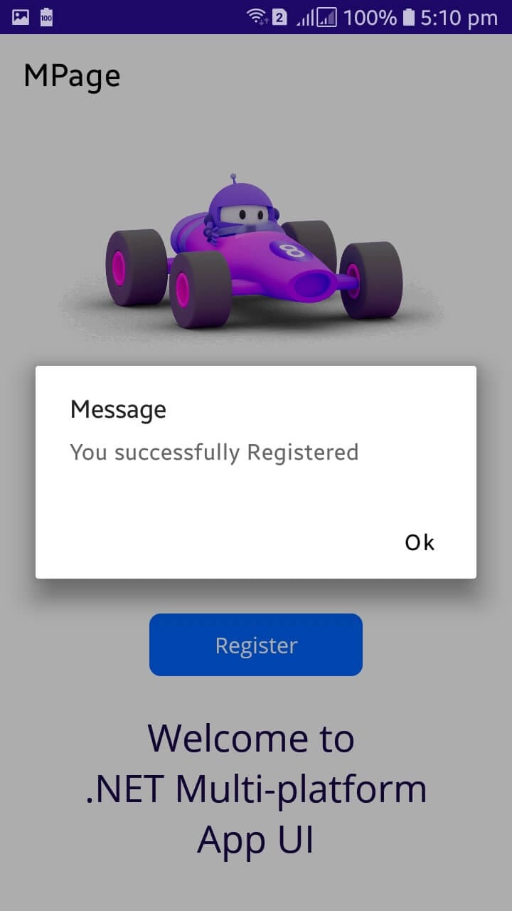
            Shell.Current.DisplayAlert("Message", "You successfully Registered", "Ok");
        }
    }
}
The model wraps the two commands that we will need for when the user clicks the buttons in the UI. For now, I will simply display an alert in the screen when each button is clicked.
Step 13: Bind the view model with the MainPage
To bind the VM with a page, we need to add these two lines to the ContentPage tag:
xmlns:viewmodel="clr-namespace:CustomControl.ViewModels"
x:DataType="viewmodel:MainViewModel"
And the controls OnCommand attribute binds with the commands from the view model:
<controls:GradientButton OnCommand="{Binding LoginCommand}" Text="Login" Width="100" />
<controls:GradientButton OnCommand="{Binding RegisterCommand}" Text="Register" Width="150" />
In the code-behind of MainPage include the following code:
using CustomControl.ViewModels;

namespace CustomControl.Views;

public partial class MainPage : ContentPage
{
    public MainPage()
    {
        InitializeComponent();
        BindingContext = new MainViewModel();
    }
}
Step 14: Run the project
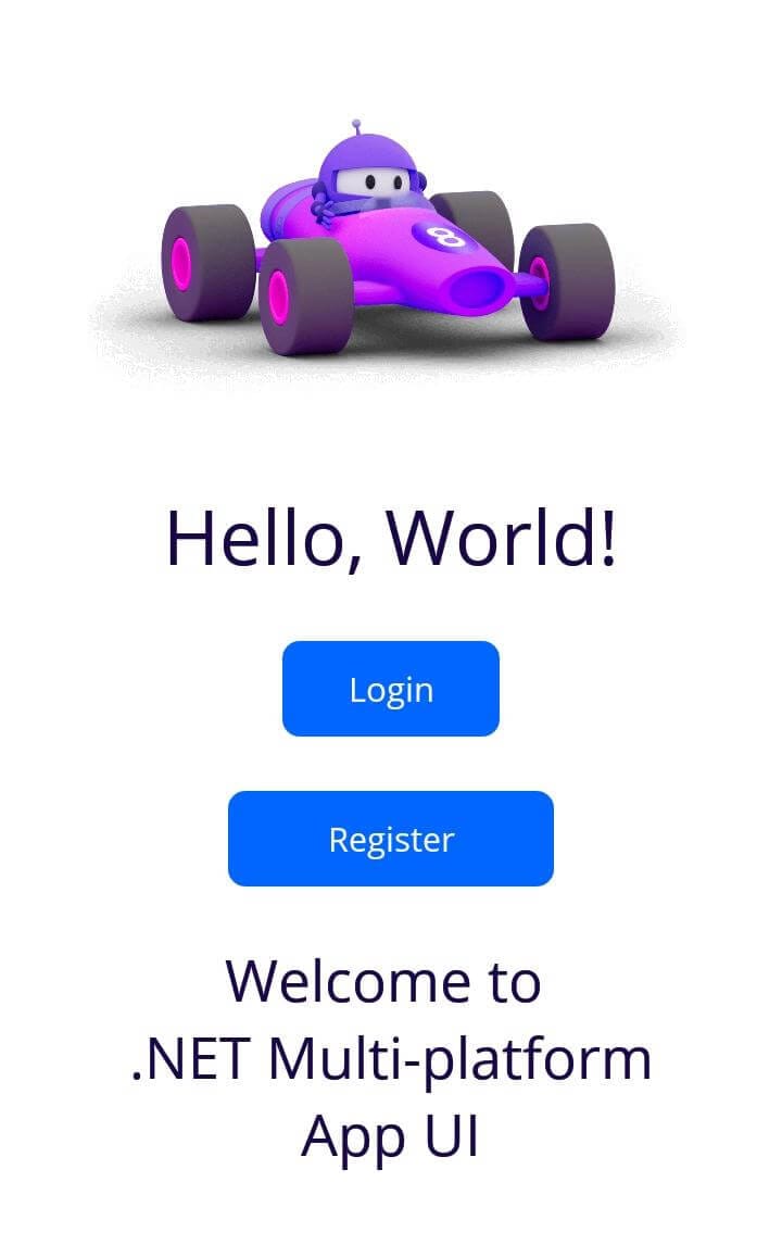
After successfully running, we can observe that LoginCommand and RegisterCommand are executed on the Login and Register buttons, respectively:
Conclusion
.NET MAUI is a popular cross-platform mobile development framework. Due to its ease of development and set of features, many developers opt for it for their small to large-scale applications. One useful feature provided by MAUI is the creation of reusable controls. With such controls, you can define a control in one place and reuse it within the application. We discussed one example of GradientButton in depth and learned how we can create custom controls to meet our needs.
elmah.io: Error logging and Uptime Monitoring for your web apps
This blog post is brought to you by elmah.io. elmah.io is error logging, uptime monitoring, deployment tracking, and service heartbeats for your .NET and JavaScript applications. Stop relying on your users to notify you when something is wrong or dig through hundreds of megabytes of log files spread across servers. With elmah.io, we store all of your log messages, notify you through popular channels like email, Slack, and Microsoft Teams, and help you fix errors fast.
See how we can help you monitor your website for crashes Monitor your website
